Showing posts with label user experience and usability. Show all posts

Tuesday, 17 November 2009

New site hierarchies display in search results

Google usually shows a green web address, or URL, at the bottom of each search result to let you know where you're headed. Today we're rolling out an improvement that replaces the URL in some search results with a hierarchy showing the precise location of the page on the website. The new display provides valuable context and new navigation options. The changes are rolling out now and should be available globally in the next few days.

Some web addresses help you understand the structure of the site and how the specific page fits into the site hierarchy. For example, consider a search for the biography of Vint Cerf (Google's Internet Evangelist). The URL for one result, "www.google.com/corporate/execs.html," shows that the page is located in a page about "execs," under "corporate," which is on the "google.com" site. This can provide valuable context when deciding whether to click on the result.

Often, however, URLs are too long, too short, or too obscure to add useful information. For example, consider this result from ProductWiki for the query [spidersapien reviews]:


The URL of this result is "www.productwiki.com/spidersapien," which doesn't provide much additional information about the site or this result. Now take a look at the result with the new site hierarchy display:


The new text provides useful information about the page. You can tell that the ProductWiki site has information about many different products, organized in different categories, and you can even tell that Spidersapien is a robot toy. In addition, each phrase in the green line is actually a link. For example, clicking on "Toys & Games" takes you to ProductWiki's listing page for all toys, and clicking on "Robots" takes you to a list of their robot toys. This way if you realize that you're interested in a more general category than this specific product (there are a lot of cool robot toys out there) you can easily access information on broader topics.

The host and domain for the site (in this case www.productwiki.com) will always be shown, so you always know what website you're going to before you click. There's not always enough room to show the complete hierarchy, so sometimes we use ellipses to replace some of the intermediate levels, like in this result for [how to make granola]:


The information in these new hierarchies come from analyzing destination web pages. For example, if you visit the ProductWiki Spidersapien page, you'll see a series of similar links at the top, "Home> Toys & Games> Robots." These are standard navigational tools used throughout the web called "breadcrumbs," which webmasters frequently show on their sites to help users navigate. By analyzing site breadcrumbs, we've been able to improve the search snippet for a small percentage of search results, and we hope to expand in the future.

When we design the way results appear on google.com, our goal is to get you to the information you're looking for as quickly as possible. Sometimes that means improving how we represent websites, and other times that means giving you new ways to explore content. We're always happy when we can introduce a feature, like site hierarchies, that does both!

Thursday, 10 September 2009

Now S-U-P-E-R-sized!

Search, that is. For us, search has always been our focus. And, starting today, you'll notice on our homepage and on our search results pages, our search box is growing in size. Although this is a very simple idea and an even simpler change, we're excited about it — because it symbolizes our focus on search and because it makes our clean, minimalist homepage even easier and more fun to use. The new, larger Google search box features larger text when you type so you can see your query more clearly. It also uses a larger text size for the suggestions below the search box, making it easier to select one of the possible refinements. Over the past 11 years, we've made a number of changes to our homepage. Some are small and some are large. In this case, it's a small change that makes search more prominent.

Google has always been first and foremost about search, and we're committed to building and powering the best search on the web — now available through a supersized search box.


Before and after on Windows XP, running Google Chrome. Click on the image for a larger view.

Posted by Marissa Mayer, Vice President, Search Products & User Experience

Thursday, 9 July 2009

Designing useful mobile services for Africa

Last week, we announced a suite of SMS services in Uganda, a country where someone's first experience of the Internet is far more likely to be on a mobile device rather than a PC. We are really excited about this project in part because it is the result of more than a year of true user-centered research and design. We knew we wanted to build useful mobile services tailored to the needs of people in sub-Saharan Africa, but how could we find out what people want from the Internet when they don't have access to it already? What would people who had never used search before want to search for if we gave them a mobile phone and said "Ask any question you like"?

In early 2008 we set out with colleagues from Google.org, Grameen Applab and MTN (a network carrier in Uganda) with this challenge in mind. Our research needed to be able to assess the feasibility of delivering information via mobile in Uganda as well as evaluate the content "appetites" of local people. Since no search engine existed for testing, we did the next best thing: We decided to mimic the experience of using a search engine using human experts.

First, we trained a multilingual team to act as user researchers in 17 carefully selected locations across the country. In each place, they introduced themselves to a cross section of people they met and invited them to participate in a free study that would help create useful services for Ugandans. If the person agreed, the researcher handed them a mobile phone and encouraged them to write a text message containing a question they wanted to know the answer to. (If people had their own phone, we reimbursed them with phone credit.) The text message was then routed to a control room we'd set up in Kampala where a human expert read the text message, typed a response, and sent it back via SMS to the person who asked the question. In the meantime, the interviewer observed and recorded the participant's user experience. This allowed us to record rich qualitative data from hundreds of interviews in just a few days, and to collect quantitative data from hundreds of search queries.

Trying mobile search for the first time

Last week's launch of SMS services in Uganda is the direct result of this research — it's based on listening to what people want and finding a way to get it to them. Our research enabled us to observe first-hand how people instinctively wanted to interact with a mobile phone. We let people select the language they wanted to use. We gained deep insights into the way people formulate their questions and what questions really matter to them. On top of that, we saw the excitement on people's faces when they got their first-ever search results, and we realized that some of the information we could deliver to these users, such as health information, has the power to truly change lives. These new services in Uganda are just one step on the path to providing information to people who have little or no access to the web. This research will help us as we continue to develop more services to increase access to information all around the world.

Thursday, 2 July 2009

The evolution of Gmail labels

I love labels in Gmail. Most email programs use folders, which only let me put mail in one place at a time. With labels, I can organize mail in multiple ways. Combined with filters to automatically label incoming messages, Gmail offers powerful ways to organize email.

When I joined the Gmail team, I was surprised to learn that only 29% of Gmail users had created any labels. At first, I thought perhaps conversation threading and search made the need to organize our mail less important. But when we talked to people who use Gmail, we got a different story. People often asked us to add folders to Gmail, assuming no system of organization existed. As one person said in a usability study, "What are labels... and where are my folders?"

We realized that if you didn't know about labels, it would be easy to assume Gmail had no way to organize your mail. Not only were "labels" unfamiliar, they were kind of hidden. So, we set out to make labels more accessible, as well as more powerful. Most of the changes have been in Gmail for a while, but we're adding some new features today. We thought you'd enjoy a peek at the method to our madness.

The first thing we did was make labels look more like the sticky notes you use in real life. Making the interface mimic things you interact with outside the computer can sometimes improve ease of use.


We also made it easier to remove a label from an open conversation:


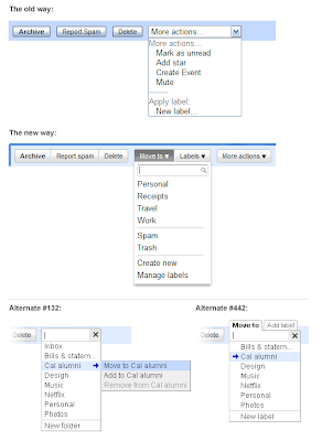
Then we worked on the actions you take to apply and remove labels. Before, to put a label on a message, you had to look under "More actions> Apply label." Not only was this option hidden in a generic menu, but the language wasn't what people are familiar with when it comes to organizing mail. We explored several alternatives:


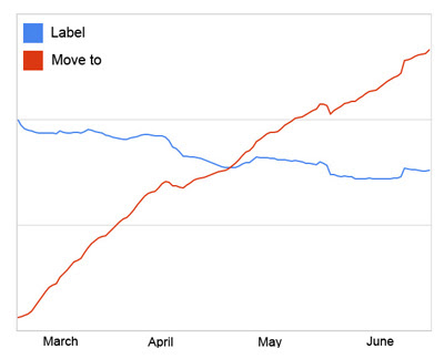
We also learned that if we made labels sound too much like folders, people got confused. For instance, while "Copy to" and "Add to" were easy to use, these terms made people think they were creating multiple copies of a message. "Move to" was familiar but didn't lead people to think they were creating copies. And people seem to have picked it up fast! Since the launch of the new menu buttons in March, we're seeing a 50% increase in new Gmail users trying labels in their first 2 weeks. And overall usage of the "Move to" menu surpassed that of the "Labels" menu within 7 weeks of launching:


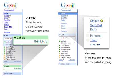
For our latest set of changes, we looked at how you access labels on the left side. In other email applications, folders get the royal treatment and are given a seat at the top near your inbox. But in Gmail, labels were stuck in a box below Chat — almost like we were telling people, "you don't want to use these." In testing, we discovered that it worked best to remove the terminology altogether and just place custom labels right under the system labels (e.g. "Inbox"):

The last step was to add drag-and-drop. Now, you can drag mail into a label, or even drag a label directly onto a message:


Making it easier to process and organize your mail requires more than just labels, but we hope these changes start to improve the process. We have much more in store, so stay tuned and keep the feedback coming.

Friday, 22 May 2009

New logo look

You may have noticed new logos at the top of some of Google's web pages, including Google Labs, Google Moderator, and Google Code. These are the result of a new logo design we are rolling out. We hope this design freshens up our look as well as improves consistency and ease of use across our sites. Now, our product names will appear in clean, simple blue lowercase type alongside the Google logo as shown here:

Since the logos appear in many different locations and sizes on our websites, our new designs are standardized to be the same size and color wherever they appear. This should make it easier for you to recognize which site you are on and navigate to wherever you want to go. They are also consistent across all our international domains, which is especially helpful for people using right-to-left languages such as Arabic and Hebrew.

We are happy with this change since it will help us streamline our user experience. Count on seeing the new logos rolling out to Google Maps, Google News, Google Docs and more over the next few weeks.

Saturday, 7 February 2009

Eye-tracking studies: more than meets the eye

Imagine that you need a refresher on how to tie a tie. So, you decide to type [how to tie a tie] into the Google search box. Which of these results would you choose?


Where did your eyes go first when you saw the results page? Did they go directly to the title of the first result? Did you first check the terms in boldface to see if the results really talk about tying a tie? Or maybe the images captured your attention and drew your eyes to them?

You might find it difficult to answer these questions. You probably did not pay attention to where you were looking on the page and you most likely only used a few seconds to visually scan the results. Our User Experience Research team has found that people evaluate the search results page so quickly that they make most of their decisions unconsciously. To help us get some insight into this split-second decision-making process, we use eye-tracking equipment in our usability labs. This lets us see how our study participants scan the search results page, and is the next best thing to actually being able to read their minds. Of course, eye-tracking does not really tell us what they are thinking, but it gives us a good idea of which parts of the page they are thinking about.

To see what the eye-tracking data we collect looks like, let's go back to the results page we got for the query [how to tie a tie]. The following video clip shows in real time how a participant in our study scanned the page. And yes, seriously — the video is in real time! That's how fast the eyes move when scanning a page. The larger the dot gets, the longer the users' eye pauses looking at that specific location.


Based on eye-tracking studies, we know that people tend to scan the search results in order. They start from the first result and continue down the list until they find a result they consider helpful and click it — or until they decide to refine their query. The heatmap below shows the activity of 34 usability study participants scanning a typical Google results page. The darker the pattern, the more time they spent looking at that part of the page. This pattern suggests that the order in which Google returned the results was successful; most users found what they were looking for among the first two results and they never needed to go further down the page.


When designing the user interface for Universal Search, the team wanted to incorporate thumbnail images to better represent certain kinds of results. For example, in the [how to tie a tie] example above, we have added thumbnails for Image and Video results. However, we were concerned that the thumbnail images might be distracting and disrupt the well-established order of result evaluation.

We ran a series of eye-tracking studies where we compared how users scan the search results pages with and without thumbnail images. Our studies showed that the thumbnails did not strongly affect the order of scanning the results and seemed to make it easier for the participants to find the result they wanted.

The thumbnail image seemed to make results with thumbnails easy to notice when the users wanted them (see screenshots below — page with the thumbnail image on the right)...

Click the images to  view them larger.

...and the thumbnails also seemed to make it easy for people to skip over the results with thumbnails when those results were not relevant to their search (page with the thumbnail on the right).


For the Universal Search team, this was a successful outcome. It showed that we had managed to design a subtle user interface that gives people helpful information without getting in the way of their primary task: finding relevant information.

In addition to search research, we also use eye-tracking to study the usability of other products, such as Google News and Image Search. For these products, eye-tracking helps us answer questions, such as "Is the 'Top Stories' link discoverable on the left of the Google News page?" or "How do the users typically scan the image results — in rows, in columns or in some other way?"

Eye-tracking gives us valuable information about our users' focus of attention — information that would be very hard to come by any other way and that we can use to improve the design of our products. However, in our ongoing quest to make our products more useful, usable, and enjoyable, we always complement our eye-tracking studies with other methods, such as interviews, field studies and live experiments.

Friday, 7 November 2008

New Google Help Forums

For the last few years, the Google Help Forums have been a great gathering place for users, developers, and anyone else who has an opinion about Google or its products. We've been taking stock of what you have to say, and we've been impressed by the hundreds of thousands of people who really understand our products and are willing to share their knowledge. It's because of experts like the orkuteers, Google Apps Power Posters, Webmaster Help Bionic Posters and many others that the forums are a great place for getting quality answers, reporting bugs, offering product suggestions and sharing tips and tricks.

To make it even easier to get you the right answers to your questions as quickly as possible and to spot the most helpful commenters, we are converting our forums to a new system designed to help, encourage and reward everyone who visits.

Some of the features include:
  • improved search results, including posts from current and new forums
  • the ability to designate especially helpful forum members as "Top Contributors"
  • a reputation and ranking system
  • the ability for users, Top Contributors and Googlers to mark questions as answered
  • easier access to Help Center content
  • expanded user profiles that highlight your forum activity

This video gives you a few more details on our latest changes:


A few products -- AdWords, AdSense, Android Market, Google Apps, Google Chrome and most of our Polish products -- have already switched to this system. Over the next several months, we'll convert more product Help Forums, initially in English and then in other languages.

If you have a question, bug report, suggestion, or just want to mix and mingle, we welcome you to "stop by" our forums. Googlers will check in from time to time to answer questions, listen to feedback, and highlight great responses and the people who provided them.

The art of the field study

I'm Dan Russell, a member of the Search Quality team doing user experience research. This post is part of our ongoing series to talk about the Search Quality team at Google, showing a bit of what we do in the day-to-day course of improving the quality of the user experience.

The role of "user experience" research is to try and get the inside story on what people do when they search. We're constantly asking: What's the user's experience of search? What works and doesn't work for them? What are they looking for? What DO they want?

To understand the full richness and variety of what people do when they are using Google, we spend many hours in the field, watching people search and listening to what they say as they do this. We hear it when they're happy, and when they're terribly frustrated. And perhaps most importantly, we also pay attention to the things they don't say -- the inexpressible "gotchas" that slow users down or get in the way of their search.

It turns out that people are masters of saying one thing and doing another, particularly when it comes to nearly automatic behavior. We find that searchers often turn so quickly to Google that they don't really think too much about what they're actually searching for. It's surprising, but often we'll see people trying to find out something about a topic, but then never actually mention the topic itself. That is, there's often a big discrepancy between what they'll tell me (the human observer) they're trying to do, and the search terms they enter into Google. One person I shadowed for the day spent ten minutes trying to find the schedule of the ferry that runs between San Francisco and Larkspur, but somehow only thought of adding the word "ferry" much later in their search.

We also study eye tracking. The eye makes a complex scan path over the search results, building up a composite picture of what is presented on the page. It's clear that what actually happens is a very rapid scan and assessment of each result as they are seen. In those milliseconds between the eye landing on the first fixation and seeing a few results, all kinds of decisions and choices are made--nearly all of them subconsciously.

In this short video, you can see three different searchers all looking for the same thing (in this case, a child's backpack). The red dot is the searcher's gaze moving around on the search results page. Notice how methodically the gaze moves from result title to title, occasionally inspecting the snippet text to gain more detail about the result.


(Video courtesy of Kerry Rodden)


So the job of figuring out what people actually do when they search isn't as simple as asking someone what they search for during the day. It's basically impossible to give an accurate telling of what you saw (or didn't see) on the results page while actively searching for a high quality results.

Memories of your own behavior are also notoriously unreliable. People's search behavior in the lab is often different than when they're at home or at work. This is a natural (and expected) side effect of lab studies: people will work especially hard to please a researcher. If we ask them to search for a pair of brown shoes they'd like to buy for themselves, in the lab they'll find the first pair that seems reasonable and then stop, satisfied. If it was real, they would go on and spend more time. We still do lab studies, but we know what to watch for, and what to ignore.

Data from field studies gives us insight into how people respond to the Google experience in ways that we can't otherwise measure.

For instance, in several field studies we discovered that many of the people who went to the previous version of the Advanced Search page had a strong, almost visceral negative reaction when the page appeared. The text of the original page had language that many people saw as intimidating--words like "Domain," "Usage Rights" and "Safe Search" can be a bit much if you're not sure what they mean.

The old Advanced Search page was a little off-putting (click on the image to see a larger version):


Based on our field studies, we dug more deeply into how people were actually using our Advanced Search page, and quickly discovered that, indeed, a large number of users were going to the page, and then leaving it without ever filling in any of the slots.

Armed with this insight from field studies, we redesigned the page, simplifying it by removing terms that were unclear to the average user (the word "occurrences," for example, just didn't mean anything to many of the Advanced Search page users), moving rarely used features (numeric range searches, date searches, etc.) into a part of the page that was expandable with a single click. That made them easy to get to for people who knew they wanted to search with those restrictions, but out of the way in a non-threatening way.

One of the other things we noted in the field study was that people often didn't understand how the Advanced Search page worked. So we added a "visible query builder" region at the top of the page. As you fill in the blanks, the box at the top of the page fills in with the query that you could type into Google. It was our way of making visible the effects of advanced search operators.

The Advanced Search page post-redesign (click on the image to see a larger version):


The good effect of these changes quickly became clear. The number of users that bounced out of the Advanced Search page dropped significantly. Interestingly, the total number of Advanced Search page users didn't increase significantly... at least not yet. By improving the UI on the page, we hope to attract even more searchers to the large range of search options available on Google.

In the end, this example shows the kind of insights that field studies can bring. As with the eye-tracking example, asking someone about their emotional response to a web page just isn't a useful way to get that data. But watching them in situ, as they actually use Google to go about their daily search lives can reveal all kinds of remarkable, otherwise undiscoverable, and actionable insights into searcher behavior.